

Shop Page Design
03/31/2026
What is Shop Page Design?
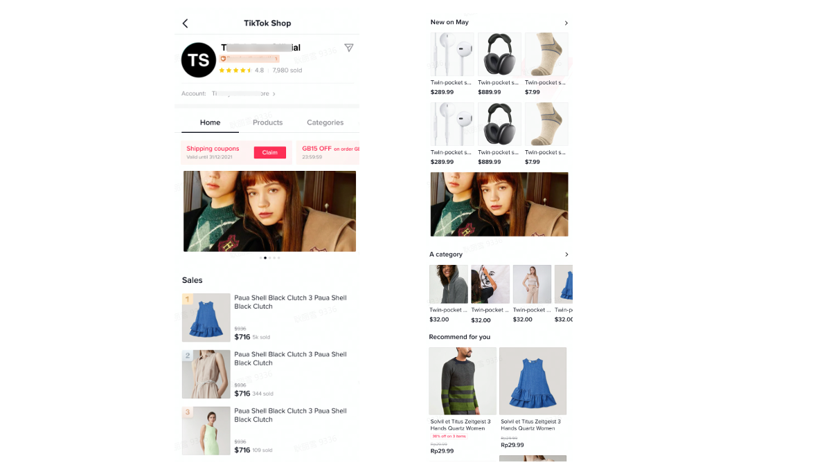
Store page is merchants' own storefront on TikTok Shop that facilitates merchants to showcase their products and brands. Apart from default homepage, TikTok Shop also provides design tools in order to allow merchants to personalize their store pages. It's easy to design a TikTok Store with simple drag-and-drop tiles.Decorating a store manually facilitates merchants to customize their default home page so that they are able to enhance their business performance and raise their brand awareness.

Benefits of Shop Page Design
- Better display products in order to enhance sales performance
- Improve session duration and click rate with banners and attractive layout
- Highlight promotions to boost conversion rate

How to design a store?
Currently, Shop Page Design allows merchants to customize banner, product and campaign sections with the tiles of text, images, videos and products.Step 1:
In Seller Center, go to the "Shop Tab" tab > Shop Page Builder > Shop Page Design > Duplicate to edit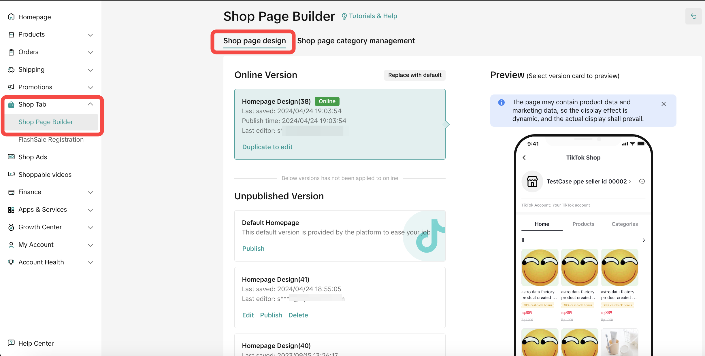
Step 2:
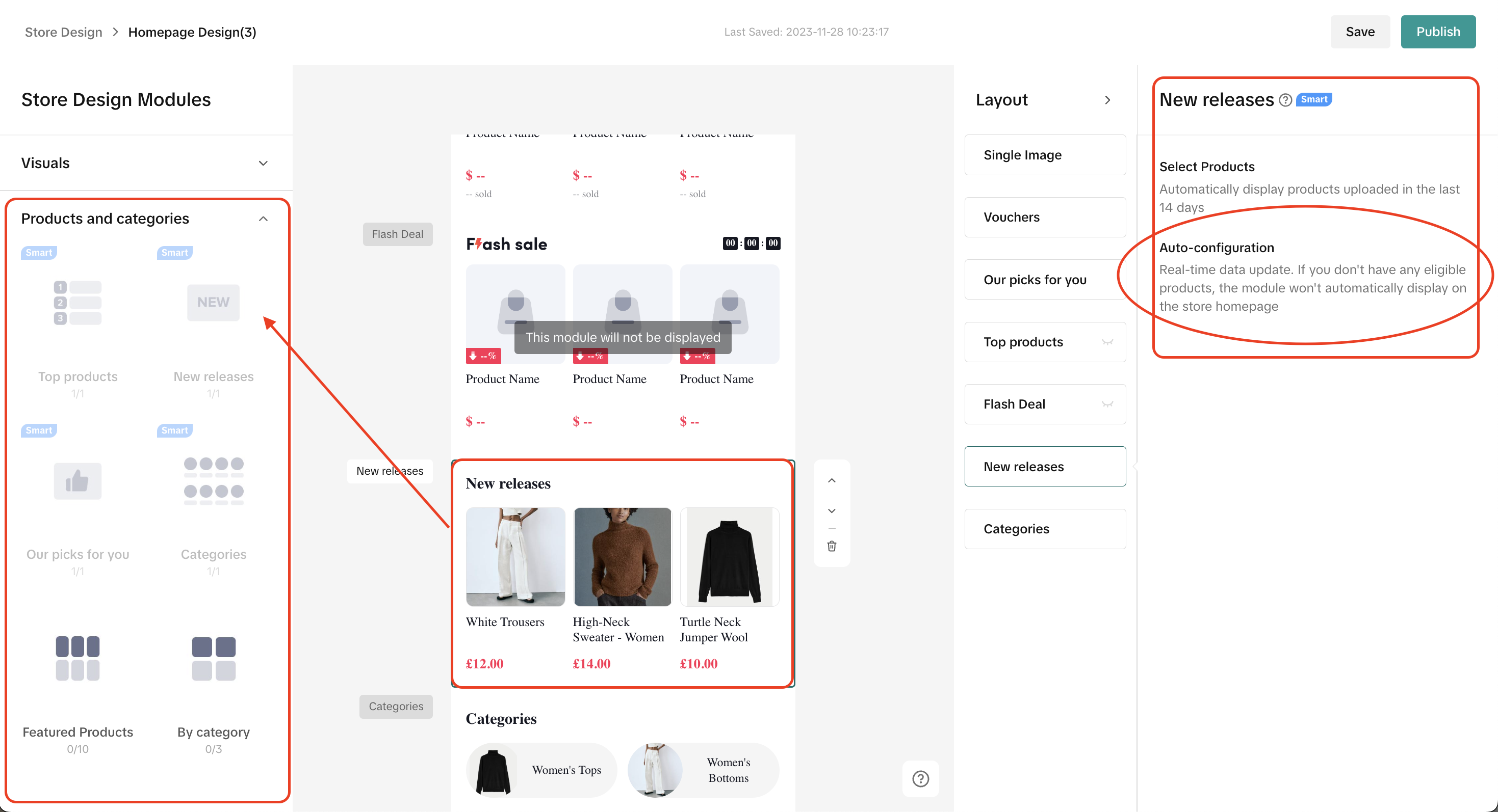
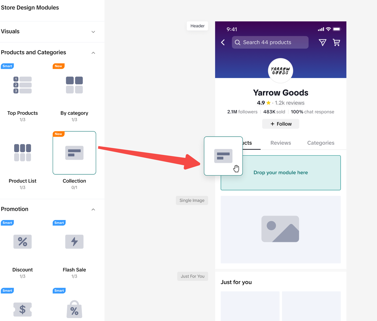
On the Shop Page Design workbench, merchants have the ability to customise banners, products, and promotions. This is done by adding components from the options on the left side and making adjustments on the right side. The manual design tiles currently consist of visual, product, and promotional components.Within the Shop Page Design workbench:
- Store Design Modules:
- These modules contain various decoration components that are available for use. Merchants can simply drag and drop these modules onto the canvas. Each component's specific requirements are displayed below it.
- Canvas:
- The canvas provides a visual representation of how the added components will appear on the store page.
- Component Property Panel:
- Merchants can further customize each component by selecting it on the canvas, which opens up the Component Property Panel for editing. This panel allows for specific adjustments to be made to each component.
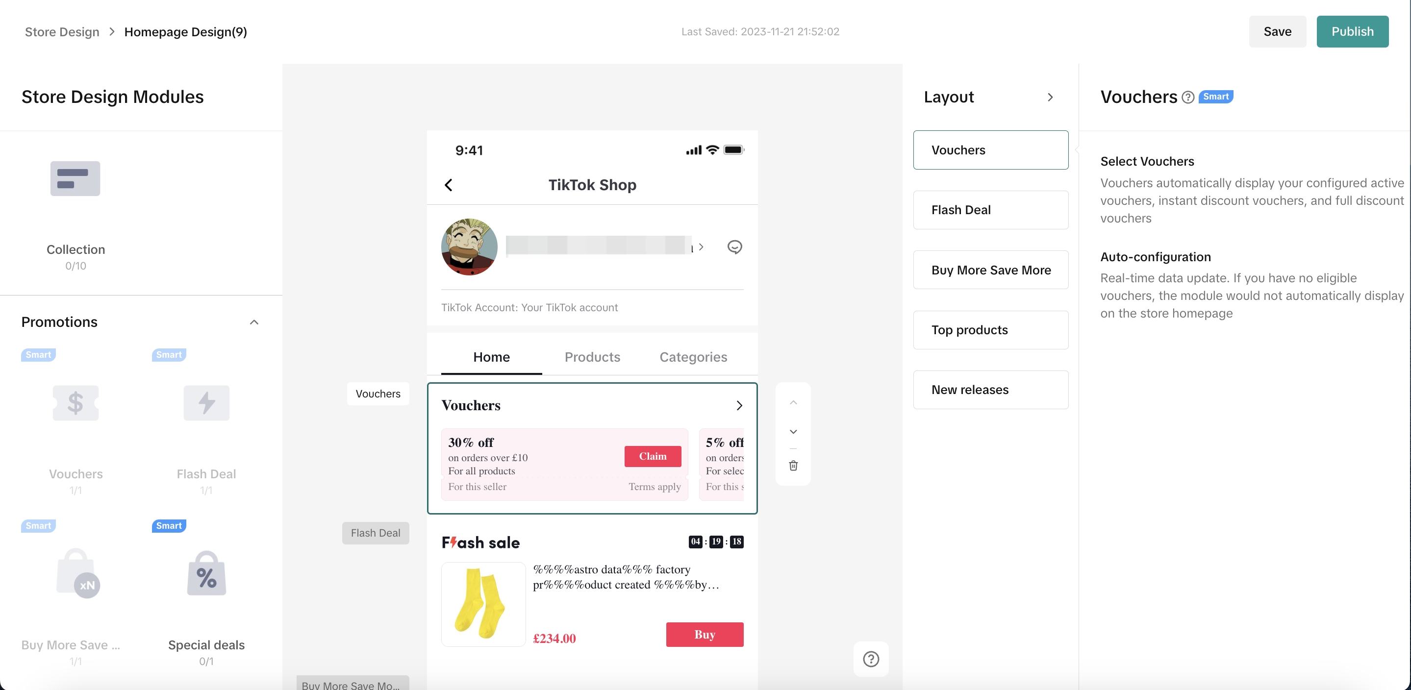
- Merchants can further customize each component by selecting it on the canvas, which opens up the Component Property Panel for editing. This panel allows for specific adjustments to be made to each component.
Store components
For more details of each component, please refer to the table below.Header
Enable sellers to customize their homepage header, to make it aligned with their brand style. Exclusive feature for Mall shops: Sellers can upload the background image and logo to strengthen their brand image at "header image" menu.
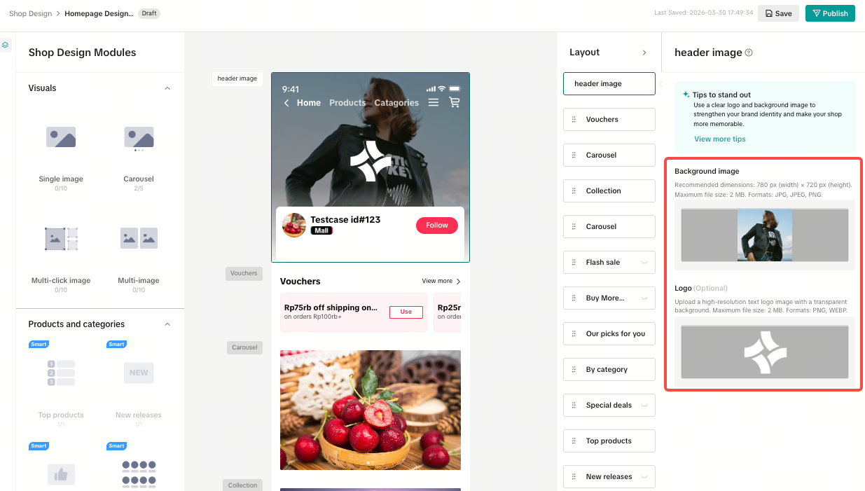
Visuals
This feature allows merchants to easily incorporate either a single image or a series of images arranged in a carousel, each accompanied by text and a hyperlink. Additionally, the Multi-click Image component enables users to navigate to various products or categories by interacting with different sections within a single image.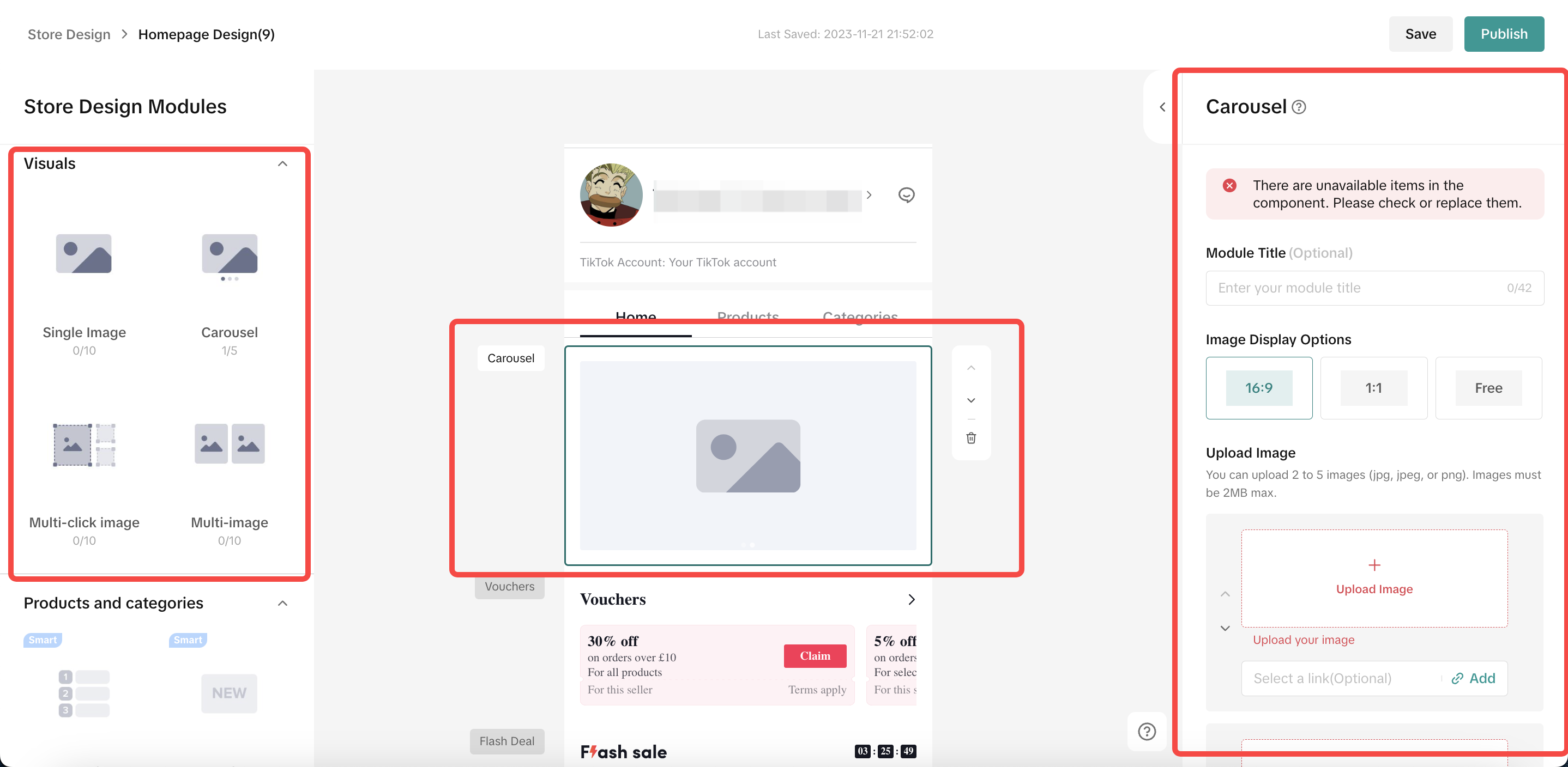
Component Name | Format | Size | Module Ratio | Number of pictures | Configurable Items |
| Single Image | JPG, JPEG,PNG | Minimum 800px;Maximum 5M | 16:9 | 1 picture |
|
| Carousel | JPG, JPEG,PNG |
| 2-5 pictures |
| |
Multi-click Image | JPG, JPEG,PNG | Recommended size 1200*675, width greater than 800. Maximum 2MB. | Free | 1 picture |
|
| Multi-Image | JPG, JPEG,PNG | The recommended size is 800*800 pixels. The maximum file size is 2MB. | Free | 2-4 pictures |
|
- Link to a product
- Link to a category

- Use Multi-click Image component to link to more products!
- Drag the Multi-Click Image component from the left side of the interface to the center of the canvas.
- Upload your desired image.
- Define hotspots on the image.
- Attach links to each hotspot, connecting to either specific products or categories.
- This functionality provides a dynamic way to highlight and link multiple elements within a single image, offering a seamless and interactive user experience.
- This functionality provides a dynamic way to highlight and link multiple elements within a single image, offering a seamless and interactive user experience.
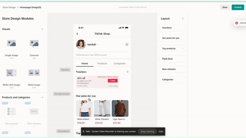
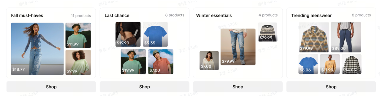
Products and Categories
Products and Categories module facilitates merchants to add "Featured Products" section by arranging the product cards and text and also supports the store being decorated with smart products and categories modules like "New Release" & "Top Sales"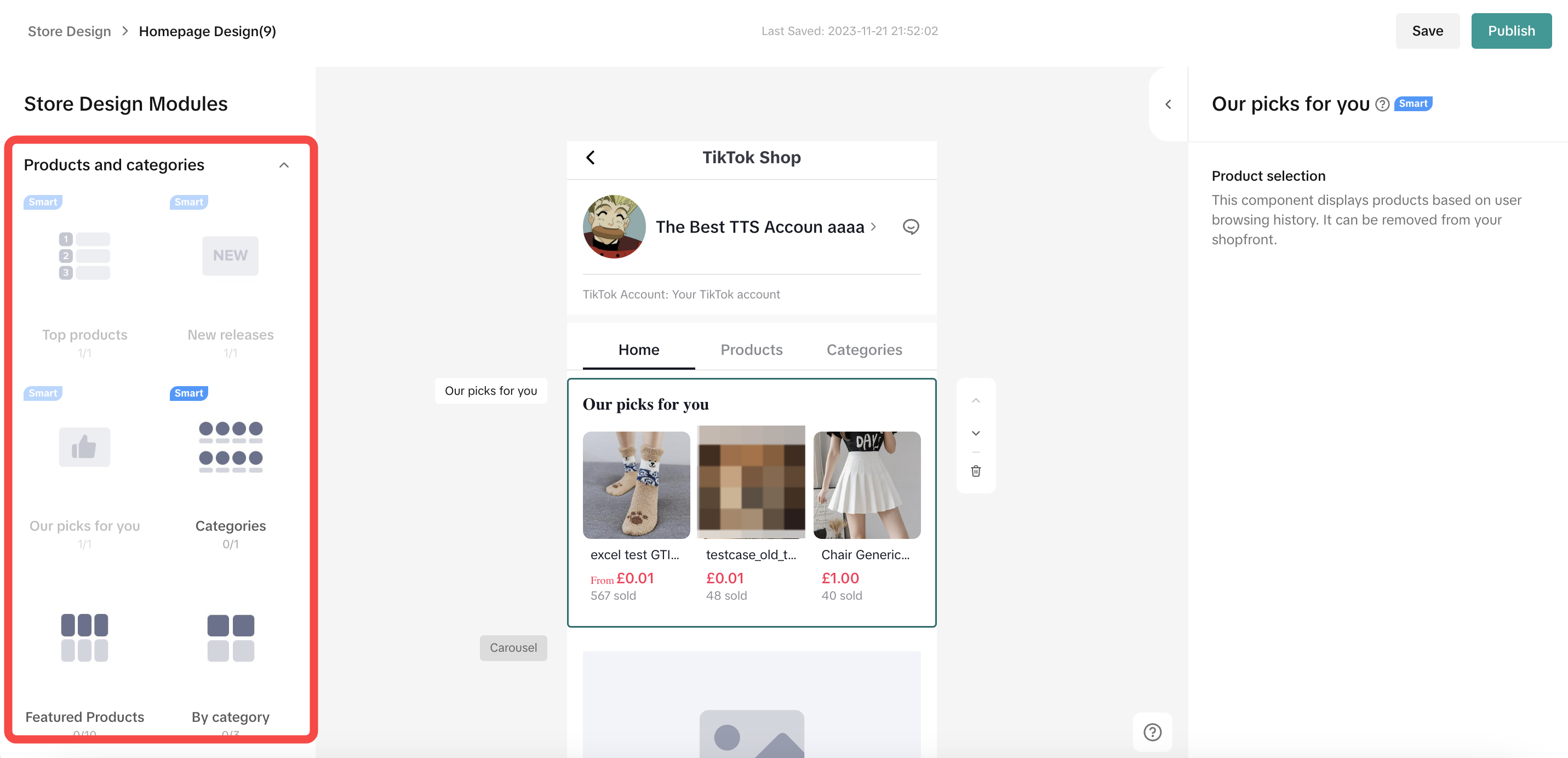
- Self-Arrange
Component Name | Layout | Number | Component Property | Demo |
| Featured Products |
|
|
| Horizontal layout   Downward layoutSecondary page Downward layoutSecondary page |
| By Category |
|
|
| Horizontal layout  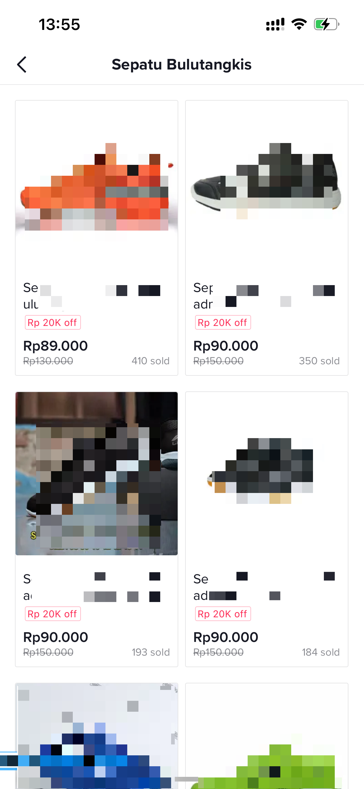 Downward layoutSecondary page Downward layoutSecondary page |
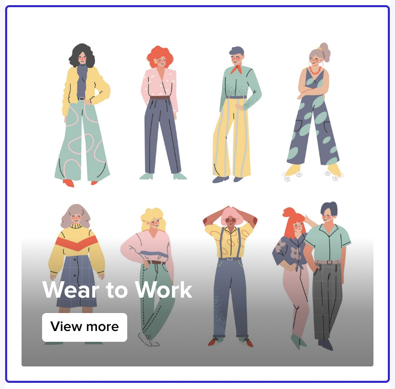
| Collection |
|
|
|  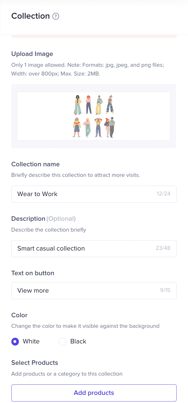
|
- Smart Components: New Release & Top Products
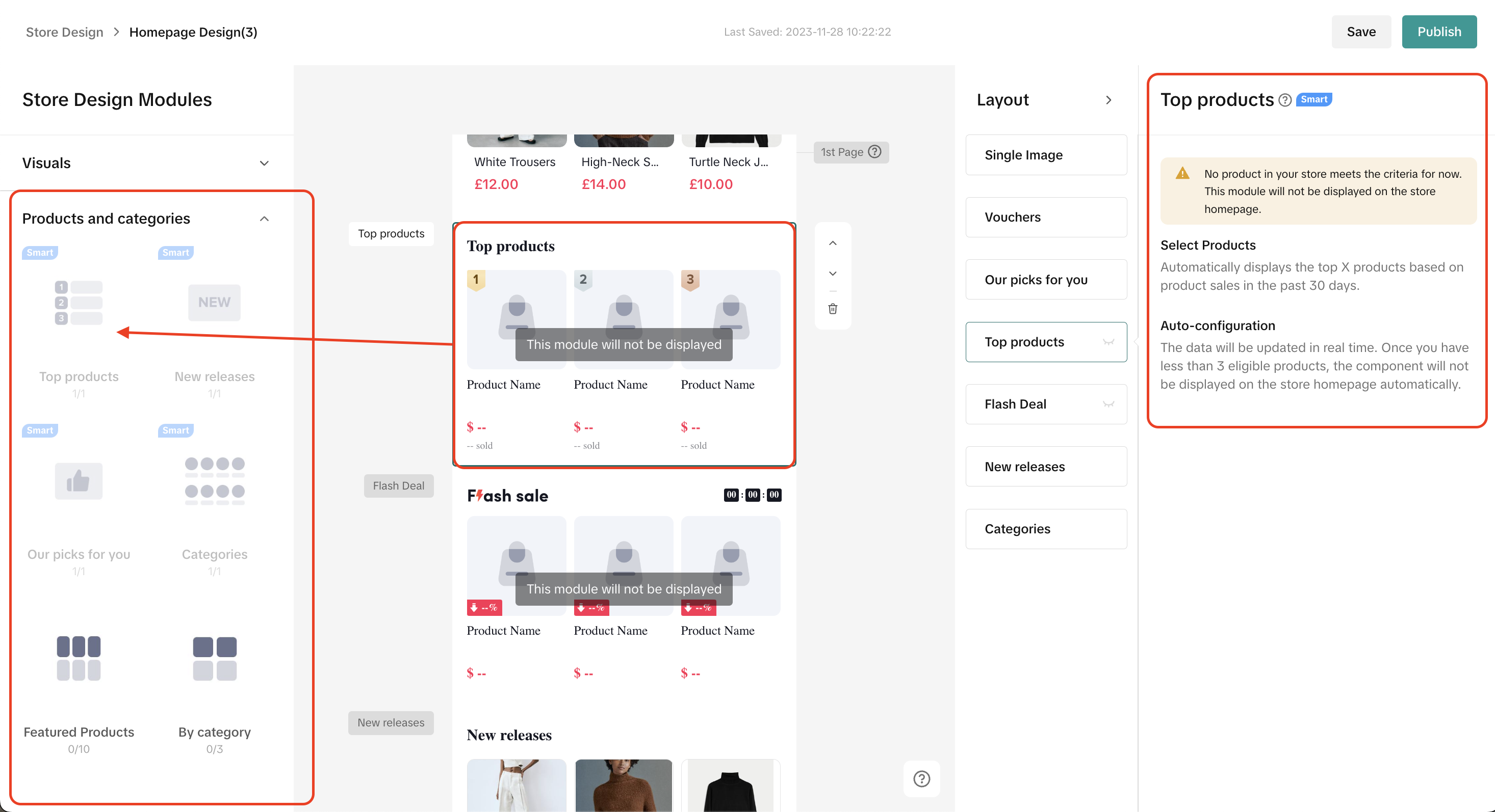
- Collections
What it looks like on Customers-end:
Promotion component
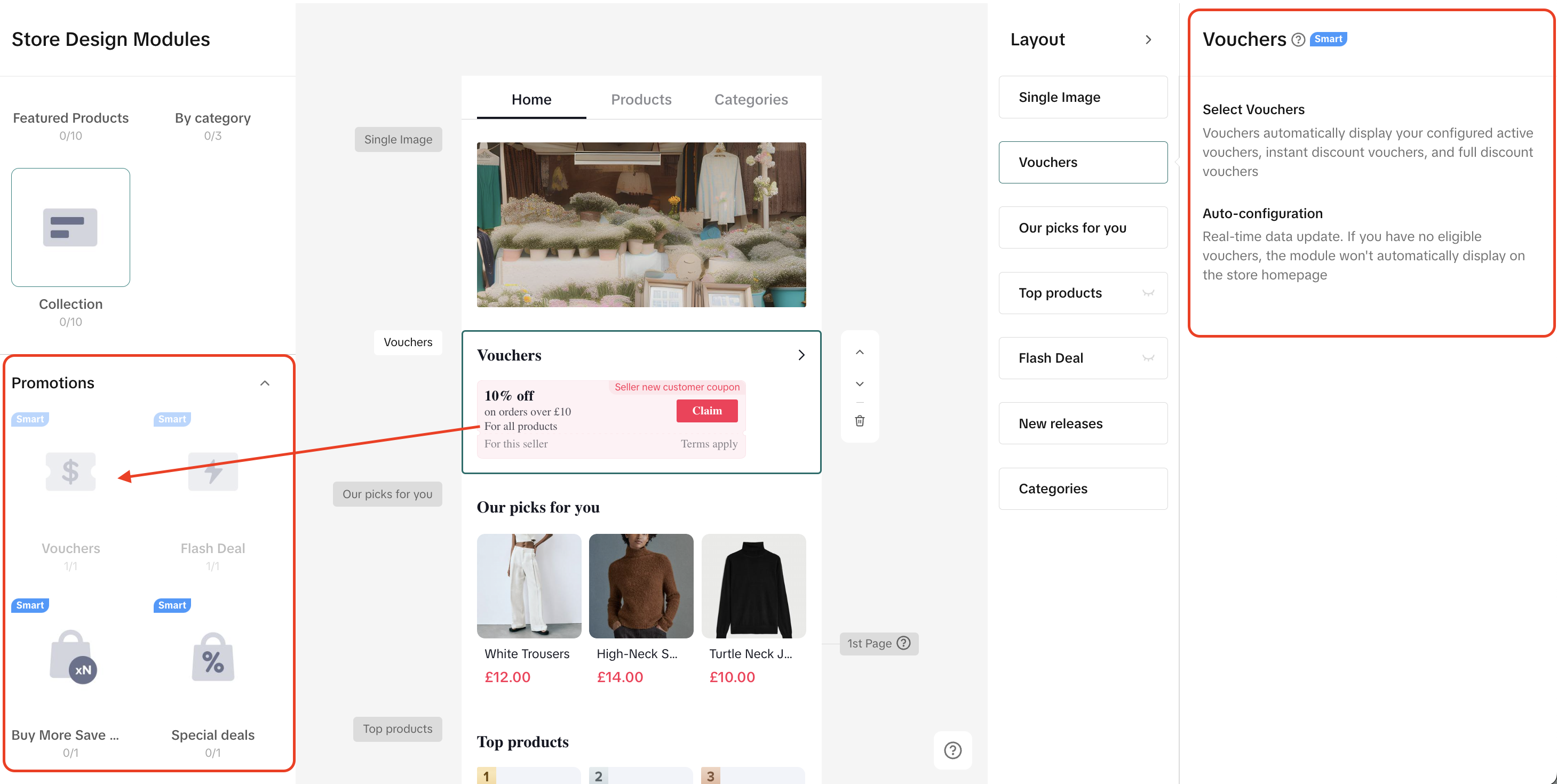
Merchants can add smart promotion components like "Special Deals" "Vouchers", "Flash Deal" and "Buy More Save More" to store page. However, due to its smart component identity, the specific information of each promotion cannot be edited here. Merchants can only follow the instructions to fulfill the requirements if there are promotions.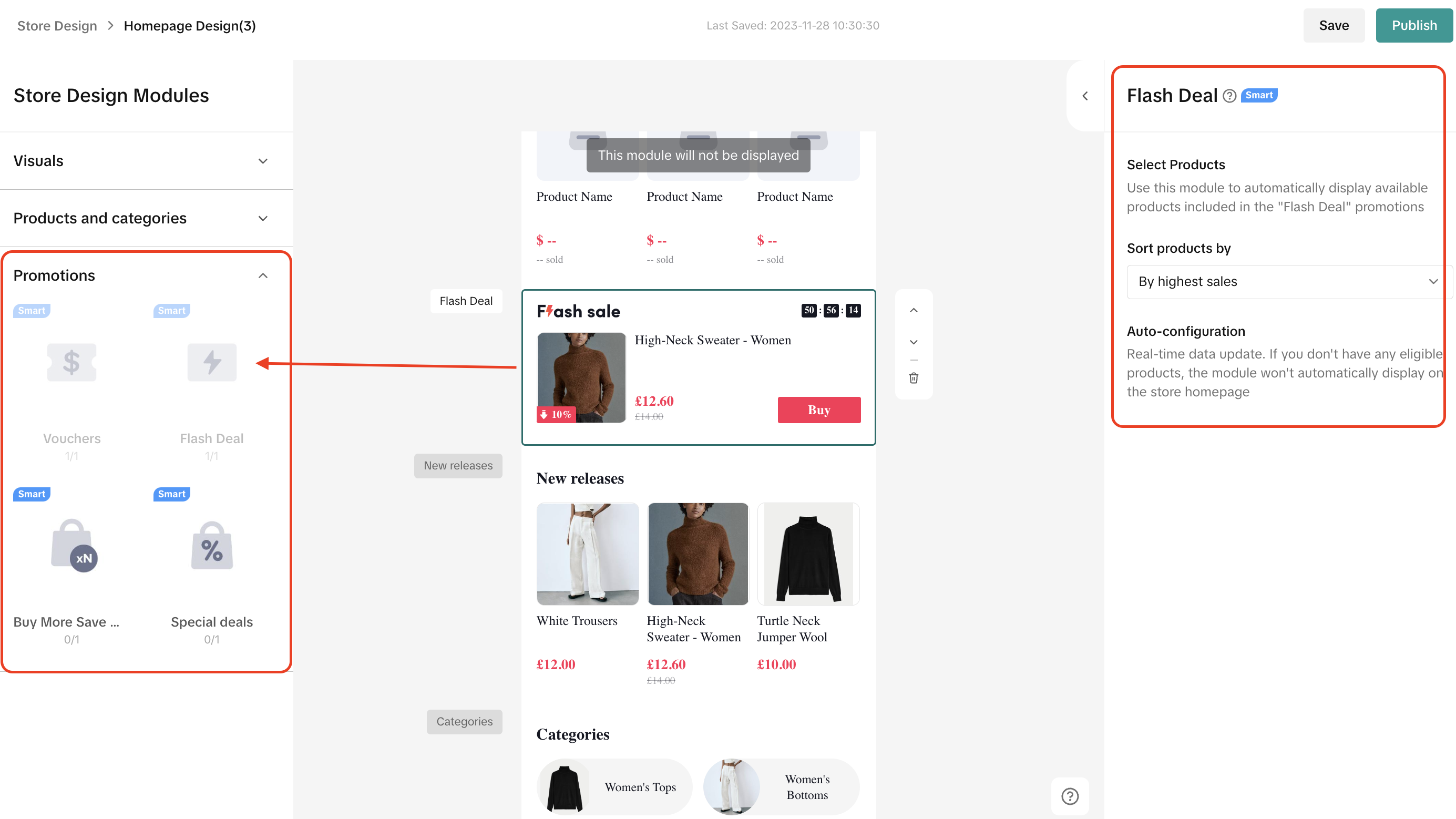
Promotion Type | What will be displayed? | Component Property | Demo |
| Vouchers |
|
| 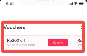 |
| Flash Deal |
|
| 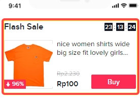 |
| Seller Buy More Save More |
|
| 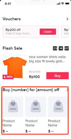 |
| Special Deals |
|
| 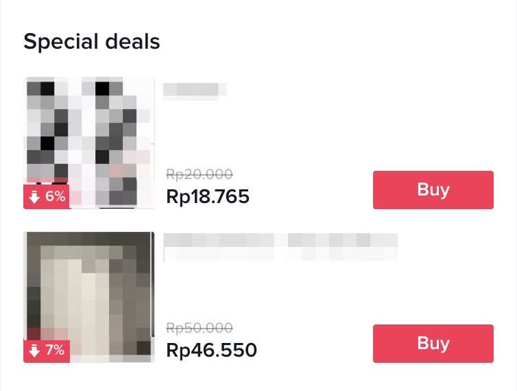 |
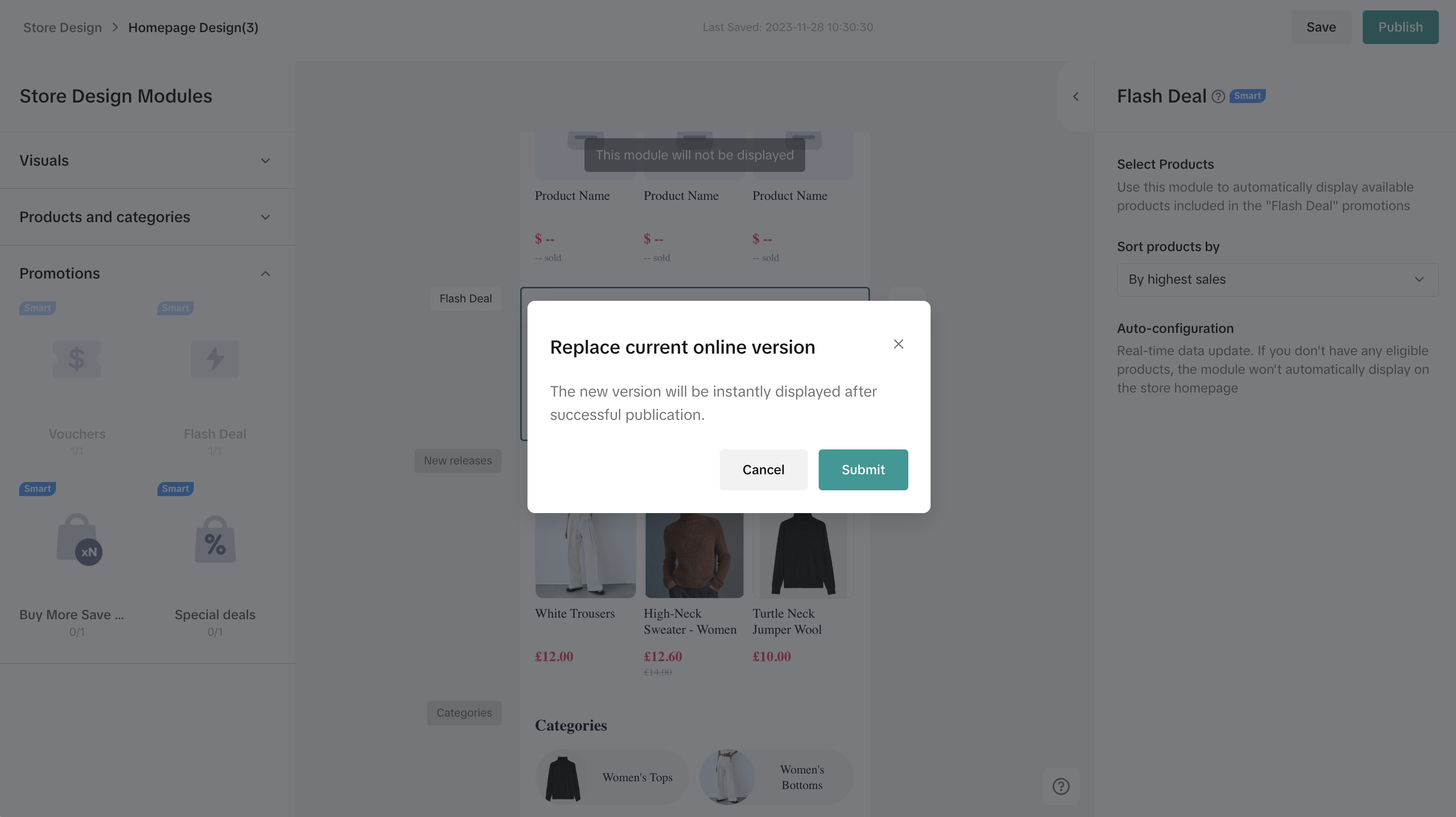
Step 3:
Once you finished building out your new store page, you just need to click "publish" as the last step. After submission, TikTok Shop will review it. Once it's approved, it will be displayed to customers at storefront. Merchants are also allowed to "preview" or "save" it if you do not want to publish it directly.There will be rejection reasons if the design does not pass review. Merchants can revise the Shop Page Design by following the instructions.

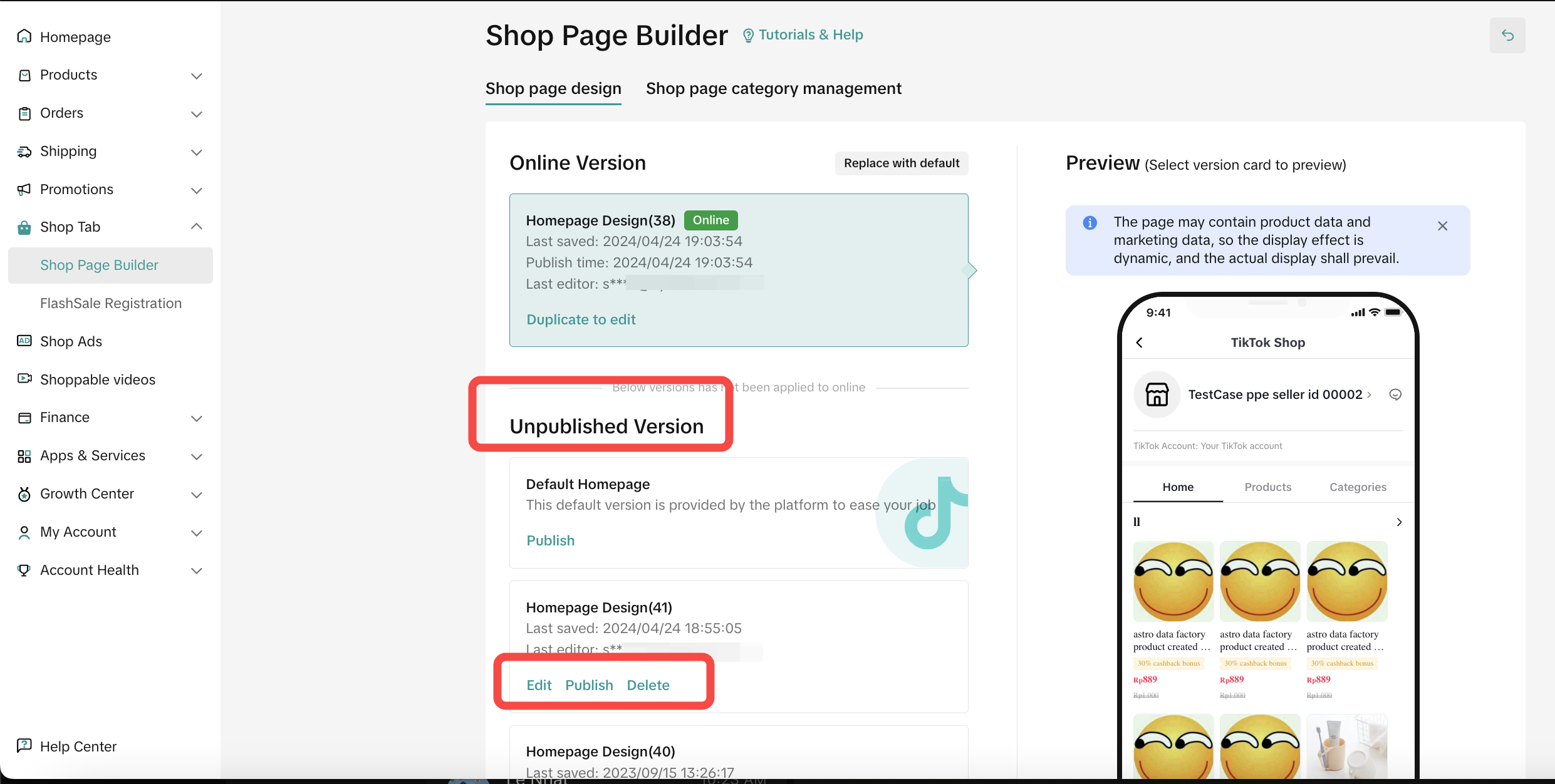
How to manage Shop Page Design drafts?
Merchants can manage different store drafts on Seller Center—Shop Page Design page.- Online Version shows the information of the online store page and merchants can click "Replace with default" to recover the default homepage.
- Unpublished Version displays "Under Review", "Change Needed" and "Default Home" versions. "Change Needed" version allows merchants to edit, duplicate, publish and delete.
- Version Preview exhibits the preview of the Shop Page Design.

Shop Page Design Review and Link Sharing
When some components of the draft do not pass the review, the newly designed store page cannot be successfully published. Sellers will be informed by emails and seller notifications.- The draft with "Change Needed" tag indicates that it does not pass the review and should be edited
- Shop Page Design workbench also guides sellers to adjust the wrong design
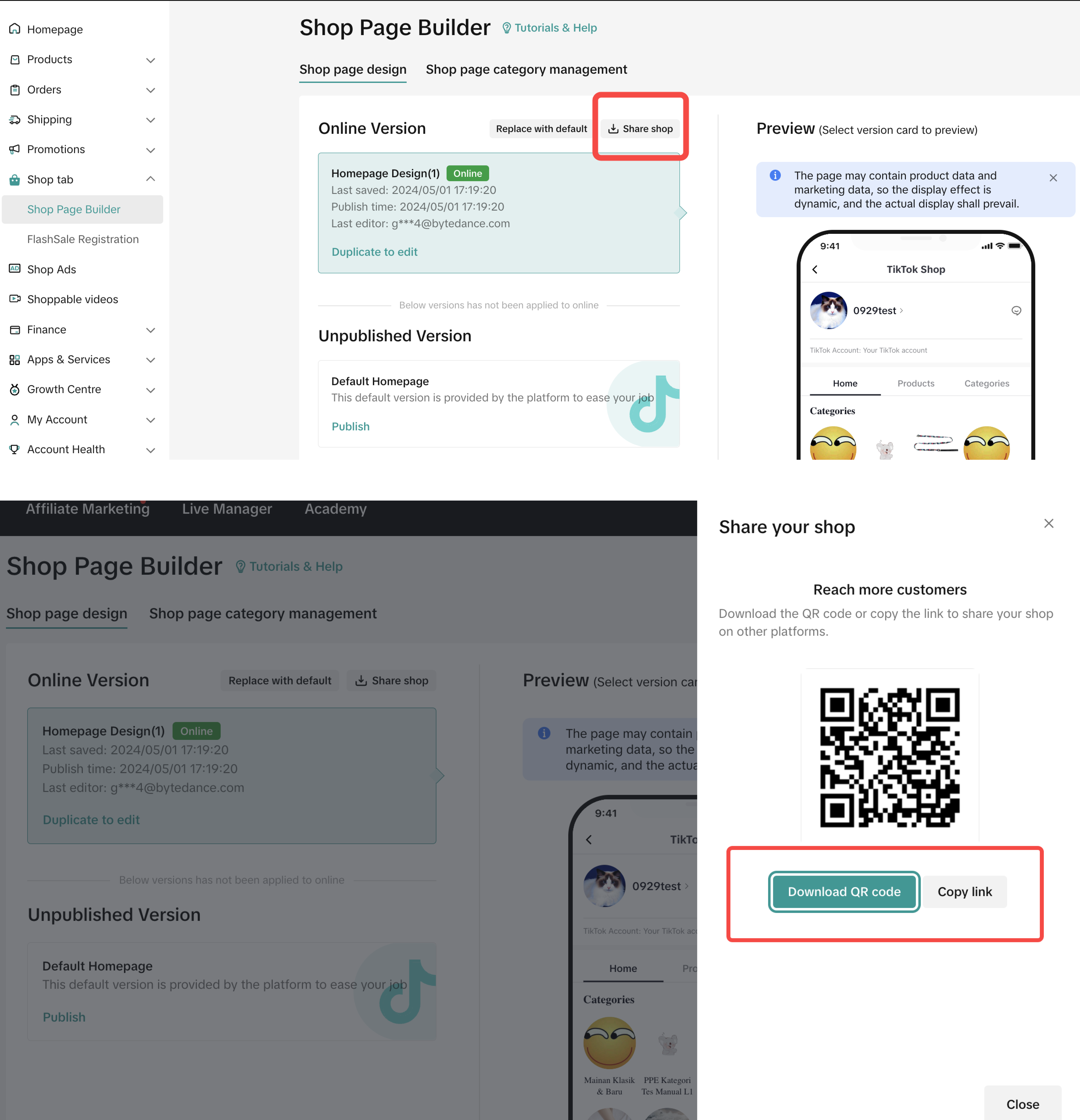
- Sellers can share their shop page link by clicking the Share Store button on the top right, and download the QR code or copy the link.

FAQ
- Why do some customers say they cannot see my designed homepage? (They still see the default version)
- Why is my shop voucher not displayed in the promotion module in Design Workbench?